On the 24fth February, we went on a trip to the Bradfird University for a careers fair. We got the train at ten and we made our way to the university, we arrived on time 10:30 and our first task was to look round the uni stalls for some information. There were many stalls locared around the area all of them different from the next. Each stall was different as they had different information.
Our first workshop was in the great hall it was presented by a man called Phillip Charles who runs a compamny called pipeline productions. He was there talking about been creative, Pipeline productions main aspect of business is workshops as the beggining of the company was the founders went around and did workshops in different places schools,community centres, youth centres. They specialise in music rap been there main speciality as there aim is to teach young people about the music community and how they can get involved and also give information from a business perspective. At the end of his workshop he mentioned that Pipeline Productions does other forms of aspects been creative writing, dance, acting and videography.
Link to Pipeline Productions: http://www.pipelineproductions.co.uk/
After Phillip there was a second speaker she wasn't from Pipline Productions, what she was talking about was her past experiences to what help her become who she was. Her name was Amy Held what she discussed was her career and what she did, apperantly she did a lot of voluntary work. My honest opinion she was a bot dull as she also stop to take breath and was a bit nervous as her attention was in other places.
Our second workshop was a Stop Motion Competition with Bill Beaumont from Distant Future along with him was his colleague Rozi Fuller. This workshop was fun as we were split into teams to make a stop motion animation. All the equipment was supplied and the final animations are been judged by representatives by people that were at the careers fair. He was impressed by our determination he is looking forward to work with us again. Also the winning team will earn a cash reward of £25 pound.
Link to the Distant Future: http://www.distantfuture.co.uk/
The people who were in my team was Robin, Phil and Dom and the ideas we talked about was a game themed animation so we opt to start of with a game of pong we did this by placing to clay rackets on the side of the laptop screen and we used Microsoft paint to make the ball then Pacman comes from the top of the screen chasing the ball he eats it eventually, then a ghost chases Pacman and sadly kills him and we made the death scene for Pacman whe he folds into himself.
Overall I think it was pretty good, I haven't seen the video in action as we had little time to make the animation into a .avi file, we used the program monkey jam to turn the animation into a video format. I didn't see much of monkey jam in action if I were to turn into a video file I would use Flash I have had some experience with it. Again we didn't have much time to manipulate the animation so we wasn't able to put any sound into it. Considering the time given we were lucky enough to get the animation done.
My opionion of monkey jam is that it isn't good compared to flash as monkey jam is a foreign program and using it was horrendous as it is much harder to use also converting the video in monkey jam took a long time and the end product required over 3GB of storage and the video slowed down the system. In Flash the images were importied into the library but flash wasn't able to process them into a functioning timeline. So we used Windows Movie Maker it worked but there were some issues with the frame rate but overall it was fine.
Our Video:
Thursday, 25 February 2010
Thursday, 11 February 2010
Ship Model Construction Part 2
Ship Model Construction

 In this lesson I have begun to make my 3D ship, I have had to change some design ideas such as getting rid of the arms and placing them as rockets. At the start I used a standard cylinder primitive and moved some face segments down, then I deleted them to make it look like a claw but I had to make some new polygons to fill some empty spaces.
For the ship I used a box standard primitive for the front of the ship I pushed some vertexes down and welded them to the ones below. Currently I am working on the wings.


Wednesday, 10 February 2010
Evaluation
For Unit 18 was the Digital Graphics For Interactive Media, what I had to do was create five icons for the Apple iPhone. To start with I researched the use of icons and symbols as this could help me understand what sort of symbol would influence each genre I am doing, the research took me through the history of symbols actually from caveman's paintings to hieroglyphics also symbols used in modern days, I also gained some understanding of what symbols mean and represent. With this knowledge I can use it to my advantage.
Since I am making App button designs for the iPhone I had to research into Apple itself, it helped me understand what sort of company Apple is as they make interactive products such as the popular iPod series also the Apple Mac and there recent project the iPad. I also researched who owns Apple its a business man called Steve Jobs who also owns Pixar.
At the start of the Unit 18 I did a collage of four genres they were War, Horro, Sci-fi, Fantasy the aim was to find images related to these genres to gain some understanding of them. This helped in chosing what image design I could use for my icons. For the total of icons made there are five and for the fifth icon it is my Unit 63 my Interactive Animation originally it was a maze but the idea of having Marvel for my unit 63 the thought inspired me to have a comic book reader for my fifth icon. In chosing what design I could have I researched images of each genre.
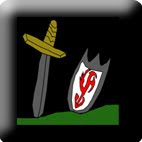
For War I decided to look at wars from old ages so I looked at the Medieval, Arthurian times the days of knights and horses seemed appealing I compared images of warfare and came up with four ideas but in the end I decided to use the image of a sword and shield stuck in the ground.
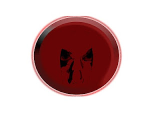
For Horror I decided not to use the basics such as monsters but somethign a bit more rare, I chose to base the idea around of my favourite game characters a girl called Alma form the game FEAR in the game she had two forms and adult and child form, I choose the child form as the expression of a child is quite a sight to behold.
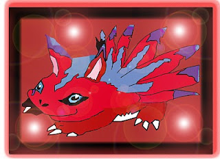
For Fantasy I decided to use a anime character from the tv series Digimon (its not aired anymore in the UK) as I have also played some of their games when I was younger I decided to draw my favourite Digimon Elecmon, the reason I chose this was because Elecmon is colourful and vibrant and also can easily appeal to a younger audience.
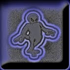
For Sci-Fi I decided to use a basic idea a grey alien which is usually shown in the Sci-Fi genre this is somewhat of a typicality but it works, this is a common design but simple at best.
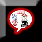
For the fifth genre I decided to base it upon my unit 63 my interactive animation, the idea of a maze seemed boring and also the animation is based on the company Marvel I thought about how I could incoparate a better idea of a maze so I thought about a comic book reader. For the icon design I had a speech bublle imprinted on to a button and placed comic book campany icons into the bubble. Such as Marvel, DC, Top Cow and Dark Horse.
For the research into the iPhone I compared the latest model to a previous one and see how it was upgraded and changed, the foundings resulted in the model been decreased in weight, the screen has a higher resolution and has more memory compared to it's predecessor.
Also to help me gain perspective of how interactive media worked I researched into how it works I watched videos on Youtube to see how the iPhone worked, I viewed videos on multiple Apps some basic and some unusual such as the alcohol app as the screen was filled with alcohol and when the used tips the iPhone the alcohol recognises it and tips with the iPhone. A basic app I viewed was a coloful one as it showed a 3D skull and the user can paint the skull with colours shown on the bottom of the screen. Regardless of how any apps worked it helped me view how interactivity is used.
Conclusion: At the final part of production I made a final concept sheet with all 5 final icons and gave reasons why I liked/chose them and also gave information on what the visual apperance would be such as colours and what shaped buttons they'll be placed on.
I made the icons in Photoshop and as a requirement I had to fill a log sheet on what I did and how it effected my work. It was quite technical but I did the best I could by giving text and viusla evidence (screenshots, Images). I only filled in parts which had a date next to it this helped as it divided sections for accessibility.
My original intentions for this unit was to create icons for the iPhone from my research to my designs, I'd say it went quite well and my intentions intende with the work I have done. The finished icons are what I expected. Development went ahead as planned I got everything done in the time given and the research was done.
If I had to do this again I would possibly change the designs for some of the genres such as war I would possibly change the weapons to a knight wielding them. Also for the comic book reader I would possibly change to a somic book character such as a personal favourite. But overall I am glad with the designs I chose.
My five icons:


Subscribe to:
Comments (Atom)

