Since I am making App button designs for the iPhone I had to research into Apple itself, it helped me understand what sort of company Apple is as they make interactive products such as the popular iPod series also the Apple Mac and there recent project the iPad. I also researched who owns Apple its a business man called Steve Jobs who also owns Pixar.
At the start of the Unit 18 I did a collage of four genres they were War, Horro, Sci-fi, Fantasy the aim was to find images related to these genres to gain some understanding of them. This helped in chosing what image design I could use for my icons. For the total of icons made there are five and for the fifth icon it is my Unit 63 my Interactive Animation originally it was a maze but the idea of having Marvel for my unit 63 the thought inspired me to have a comic book reader for my fifth icon. In chosing what design I could have I researched images of each genre.
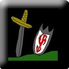
For War I decided to look at wars from old ages so I looked at the Medieval, Arthurian times the days of knights and horses seemed appealing I compared images of warfare and came up with four ideas but in the end I decided to use the image of a sword and shield stuck in the ground.
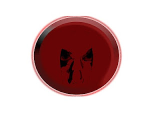
For Horror I decided not to use the basics such as monsters but somethign a bit more rare, I chose to base the idea around of my favourite game characters a girl called Alma form the game FEAR in the game she had two forms and adult and child form, I choose the child form as the expression of a child is quite a sight to behold.
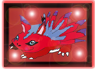
For Fantasy I decided to use a anime character from the tv series Digimon (its not aired anymore in the UK) as I have also played some of their games when I was younger I decided to draw my favourite Digimon Elecmon, the reason I chose this was because Elecmon is colourful and vibrant and also can easily appeal to a younger audience.
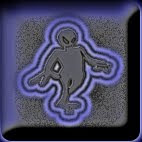
For Sci-Fi I decided to use a basic idea a grey alien which is usually shown in the Sci-Fi genre this is somewhat of a typicality but it works, this is a common design but simple at best.
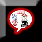
For the fifth genre I decided to base it upon my unit 63 my interactive animation, the idea of a maze seemed boring and also the animation is based on the company Marvel I thought about how I could incoparate a better idea of a maze so I thought about a comic book reader. For the icon design I had a speech bublle imprinted on to a button and placed comic book campany icons into the bubble. Such as Marvel, DC, Top Cow and Dark Horse.
For the research into the iPhone I compared the latest model to a previous one and see how it was upgraded and changed, the foundings resulted in the model been decreased in weight, the screen has a higher resolution and has more memory compared to it's predecessor.
Also to help me gain perspective of how interactive media worked I researched into how it works I watched videos on Youtube to see how the iPhone worked, I viewed videos on multiple Apps some basic and some unusual such as the alcohol app as the screen was filled with alcohol and when the used tips the iPhone the alcohol recognises it and tips with the iPhone. A basic app I viewed was a coloful one as it showed a 3D skull and the user can paint the skull with colours shown on the bottom of the screen. Regardless of how any apps worked it helped me view how interactivity is used.
Conclusion: At the final part of production I made a final concept sheet with all 5 final icons and gave reasons why I liked/chose them and also gave information on what the visual apperance would be such as colours and what shaped buttons they'll be placed on.
I made the icons in Photoshop and as a requirement I had to fill a log sheet on what I did and how it effected my work. It was quite technical but I did the best I could by giving text and viusla evidence (screenshots, Images). I only filled in parts which had a date next to it this helped as it divided sections for accessibility.
My original intentions for this unit was to create icons for the iPhone from my research to my designs, I'd say it went quite well and my intentions intende with the work I have done. The finished icons are what I expected. Development went ahead as planned I got everything done in the time given and the research was done.
If I had to do this again I would possibly change the designs for some of the genres such as war I would possibly change the weapons to a knight wielding them. Also for the comic book reader I would possibly change to a somic book character such as a personal favourite. But overall I am glad with the designs I chose.
My five icons:

No comments:
Post a Comment