I am studying Computer Games Design at Huddersfield University Please don't be afraid to comment, I accept criticism well.

 for natural reasons.
 Here is my robot which I made in studio max, it's half head half hood. I would have made a body but the camera wasn't so friendly so I was unable to instead I gave it a hood.
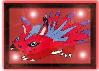
 This is my first idea, its basic but it looks good I think.

This is the finished product, I added some effects that originated form brushes such as the lightning That originally was from a brush but I changed the colour of it to go with the colour scheme. Also as you se e on the planet that shiny blueness that also was from brushes. The reasons I chose them was because I wanted to add some more depth to the desktop. Also as you see on the mini planet I have placed a special effect originally it was supposed to be an explosion but it didnt go right so I salvaged it and I worked with it to match the theme. Also the font suits the theme as the font is Space.1 which I got from the website 1001 fonts. I also place the logo in the corner and I made it transparent so it wouldn't clash with the colours. I also added media suite to show where this desktop was made. I placed the icons on the bottom of the screen as there was space at the bottom and also they are above the student charter so they can clearly see what some rules at Shipley College.
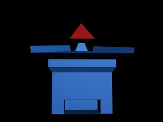

My first animation I did on Studio Max. I used the bend modifier to distort the words and eventually they rotate into their original position.
The star was extruded to look 3D. I used the total of 9 keyframes for the animation, since this is my first time making an animation, it wasn't the best but next time it I will improve on this.


The font was Carminsa. I attached the hexagon to the text, and after I extruded them and I manually inserted the star and I had to manually extrude that.
Considering the background is black I changed the colour of the hexagon to blue so it wouldn't clash and now I can see that it has a nice 3D effect.
This is a Collage I did at college at the start of the year. We had four genres which we had to find images for. There were Horror, Sci-fi, Fantasy and War.
I like the giant robot.
And if you look at the horror part you can see Tingle from The Legend Of Zelda and yes he is scary.
This is part of my desktop project it's to give some ideas on what desktop image should look like and what content it should contain.
