Thursday, 22 October 2009

Photoshop Practice

I have done some practice on photoshop using turtorials to create backgorunds for some of my work, I just wanted to show what I have made.

.

Final desktop background

I have finished the desktop background, and here is the finished product. I have placed the icons at the bottom of the screen where there is space for them. I added special effects to it on Adobe photoshop, such as brushes on the bottom of the image and on the surface on the planets, on the little planet I made a little special effect it was supposed to be an explosion but it turned out like that.

Wednesday, 21 October 2009

Desktop Project Evaluation

I have finished the evaluation, but a little bit confused on how to put it on the blog.


Ideas for my final desktop design

I skecthed four ideas for my desktop design, the theme was sci-fi so I decided to draw some planets and some ships (basic ideas), I admit they are not of the best quality but at least I tried and I think that the ideas really do show some potential.


This is my first idea, its basic but it looks good I think.
The images here are some planets, I would like to use these as they are visualy striking and impressive. Also it has been annotated to show where content will go.


This is my second idea what I thought was that all of the sci-fi films I have seen they have ships so I thought I'll do that and so i have also I have a planet in the backgorund as in contrast shows how big the ships are.

Thursday, 15 October 2009

3D studiomax practice

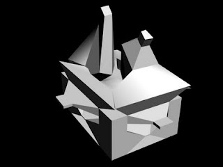
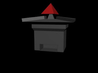
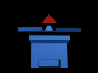
Some more 3D practice I made a building but with a random design, just a little experimentation. Random is a good thing to go with. I used edged lines to help me with manipulating the box, I made it into an editable mesh and used the polygon option in the sub selection menu and with that I went a bit insane with the design and the resulting conclusion are the images below. I also used vertices to add vertexes to make the polygons into one instead of having all of them seperate, it helps keep it organised and tidy.


Desktop project

I have finished my desktop project.

This is the finished product, I added some effects that originated form brushes such as the lightning That originally was from a brush but I changed the colour of it to go with the colour scheme. Also as you see on the planet that shiny blueness that also was from brushes. The reasons I chose them was because I wanted to add some more depth to the desktop. Also as you see on the mini planet I have placed a special effect originally it was supposed to be an explosion but it didnt go right so I salvaged it and I worked with it to match the theme. Also the font suits the theme as the font is Space.1 which I got from the website 1001 fonts. I also place the logo in the corner and I made it transparent so it wouldn't clash with the colours. I also added media suite to show where this desktop was made. I placed the icons on the bottom of the screen as there was space at the bottom and also they are above the student charter so they can clearly see what some rules at Shipley College.

Thursday, 8 October 2009

Basic Box Modeling

I had some more practice on studio max and what I was doing was some basic box modeling what I made was a house. It was basic to make but it had its trouble to make as well.


I started with a box I dived each side into five sections and then selected I modified the box into an editible mesh, and selceted the polygon in the sub seletion menu and I highlighted certain squares I wanted to modify.
I did that and extruded the top part of the box model and then I selected the scale tool and scaled the top to make a roof.


I did the same to the front section of the box and pushed the highlighted squares inward for some strange reason.
For the pyramid at the top I made a chimney using the same method for the roof for a more better building I added a pyramid and put it above the chimney, I changed the colour of the building to make it more bright so it is easier to see the building.


Monday, 5 October 2009

Making a rollover button in flash

I started to make a rollover button on flash but for the design I made that in Photoshop First I made basic shape with the rounded rectangle tool, added two 3d effects that were bevel and emboss, and drop shadow.


To make it a game theme I added Bomberman and put him in the middle of the button.