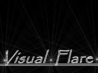
This is the base design for our logo as we agreed that we should make an individual design and then combine and vote to see what the team logo can be. We developed the wording and glow features in 3D Studio Max. Afterwards we will make a certian amount of individual designs.
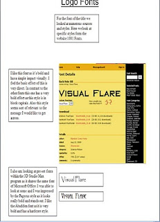
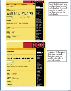
For the fotn we decided to use a pre-set font as we scanned through the different styles I noticed a font that seemed familiar, and after simulating what it may look like we decided to use the Papyrus font, for the viewers it may look familair (its the font of Avatar)
Wednesday, 29 September 2010
Moodboard
We constructed a moodboard to help inspire us with our designs. When we were looking for ideas and scoured through boooks for original source material. We looked through books that were relevant for our cause.
We looked through books that held siginifigance, for a major source we looked at a book that held pages of how colours combined can look effective as there are different tones and shades. Also for a general definition for a logo design we looked at logos that already existed. We also looked at images that had visual effects such as adverts or photos. One of my favourites was a random photo with a tiled space invader that was inspirational at is unexpected in such an environment. Also we put emphasis on shapes as freqyuently we have images that have base shapes and also some images that have a 3D effect.
We also looked at logos form current games studios today as we have analysed companies such as Lionhead Studios, Bungie and Codemasters. I feel that the moodboard has really affected our creative guessing as we are anticipatiing what logo we can make but we all know that the logo should match the name. Expect bright, flourescent designs.
Brainstorm
We made a brainstorm to help collect and collate ideas for a potential logo design. We donconstructed our task and made areas of what is needed for a logo. Such as colour, font and shapes. This was a simple look and review so we can stick to our assingments.
As we set out our brainstorm we started the most general information Team memebers was confirmed. Then to more important the design of the logo we all agreed was that it had the name Flare then we would nedd some design of bright colours, something vivid.
We comprised the design with one simple shape, we based the logo on a rectangle but we had it coloured black so the flare colours would stand out. For the main colour scheme we thought would colours would contrast well, so we considered all the bright colours possible to white, light blue, red and yellow.
For font we decided that we want to use somethign simple and old, we looked through pre-set fotns and we decided on the Papyrus font which is famous for been the Avatar font. For features we wanted the name to glow so we thought of a possible design to show how flourescent it could be.
Thursday, 23 September 2010
Sky Boxes
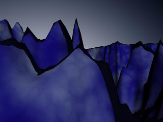
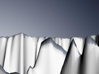
Today I had a practice at making a suitable sky for our environment, a skybox.
I had a choice a box or a geosphere. I chose geosphere.
I converted it to a editable mesh and scaled it so it engulfed our environment and with the excess faces I deleted them. Since the faces were faced away from the landscape I activated normal which shows the direction of where the faces are facing. I pressed Ctrl + A to earn the option to flip them all, and then I created a texture for the sky box. I wanted to create a cel-shaded sky so I made it look as bright and vivid as possible. The one on the bottom looks like a antartic environment.
Thursday, 16 September 2010
Official LandscapeRender
Today, we started to learn how to create environments using a simple method.
First of all I accessed photoshop and studio max in tangecent. For our Photoshop document I requried the canvas height and width to 512 and 512 and for the screen resolution I set to 72 DPI. What I did first was set the background black and then I created a white sections which lead to the centre and to the edge which the colour tone became brighter. Then I used the smudge tool to manuipulate the different shades and made them interact and correspond with each other.
Then I added layer and made this the ground part of my landscape in this case red grass. I filled in the parts which was darkest and I maintained the shape by filling the black empty areas and this became the valley. I added a filter effect Noise as this helped make the grass look more visually effective. I toned down the noise as it looked to multicolored.
Then I added one more layer as this would be the color of the stone which would be of the mountain. I used a darken color effect to make the stone look tainted by the color of the grass. For the final layer this would be the peak of the mountain I wanted to make this look like a blood snow effect so I had the color of the snow a bright red with a mix of white and I added another Noise effect to help make it more visually real.
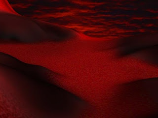
I opened up Studio Max, I used the Plane standard primitive and gave it 100 lentgh and 100 width segments. I added a displace modifier and I gave it my displace texture. Then I added the dsplacement strength which totalled up to 61. I also added a blur effect to make the surface more smooth. Then I added a background which was of a dawn sky which looks like its on fire.
Subscribe to:
Posts (Atom)