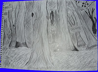
For the environment I have chosen a suitable theme that goes well with the game trailer. For my official design I have gone for a simplistic view of a forest. I have left the image as a line drawing as I have applied extra solidarity with a fineliner to help make lines look extra bold. Also I have added extra shading to help ut the emphasis on scale as the trees closer to the front of the image are more vivid with texture and shading contrast. For the refrence image I have taking that from the Claymore Manga, another reason I kept that image in black and white as it is an acknowledgement to the source. Since I will make this in 3D this environmetn is very possible as the image is in constant contrast with scale, textures and lighting. This is a perfect image to look upon for inspiration
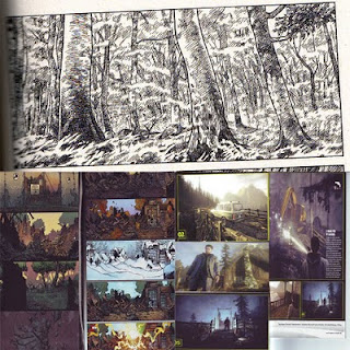
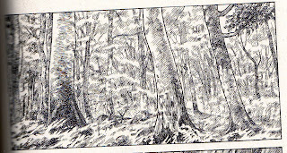
This is the refrence image:
This is my official environemt for the game trailer:
But I have explored further development with a different design with a different creative approach. I have gone for an abandoned building in the midst of winter. Gain for a genreal impact I have gone for a fineline effect and also to show a different visual effect I have used four different art techniques. I divided the image into four parts with each section dedicated to different styles. For the top left I have used pencil crayons to help display what creation could appeal. The colours contrast well as the tree has a rugged texture which helps it looke more realistic. Also felt tip pens feature in the practice image which helps add contrast to the image but overall it is quite appaling with the colour scheme on the other hand it is bold and has a lot of clarity. For the bottom right of the image I have used pastels since snow dominated this section I experimented with different shades to help it make look vivid and detailed, the use of pastel helped the image look a bit more 3D as the blood splatter looks realistic and the blue tint in the snow piled up against the wall looks far superior to any other detial in the image. What I liked about the pastel that it is very easy to apply to an image and also simple to manipulate with the technique of shading and texturing. If I decide to use snow in the game trailer I will definitley look at this for an idea. For the bottom left I have left it as a pencil drawing as I didn't want to cause more damage to the image. Overall, I am happy with what I have done for the experimental design.


 Also I have added a lighting effect to the scene whilst also tinting the sky to a night scene.
 And just below I have applied a lighting effect as it looks like the sky is practically been torn apart.