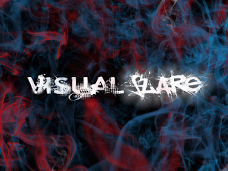
1. Dom's logo - Chosen logo.

What I like about this logo is the design of it as it is very impartial for what I have forseen as a suitable team logo. The name really does suit this design well as there is the evidence of a flare as there is a colourful smoke as the effect looks very realistic. The logo is very visual as the font has effects such as glowing and the font of the words really do stand out. Overall this is what I call a proffesional industry standard logo.
UPDATE:
Dom's logo was voted (by the class) as the final team logo. Out of all the team members he recieved ten votes as he had the most, the final logo has been decided.

No comments:
Post a Comment