Thursday, 17 June 2010

Environment Practice

I had some practice with creating some environments, with this one I designed a scorched earth environment. With this environment I have added some fireball effects to go along with it the Blue stone bulding was supposed to be a crystal texture but you can't unwrap a standard primitive.

Wednesday, 16 June 2010

Comparing the Storyboard to a professional example continued

Now I will compare the storyboard itself.

Myself I am a big fan of comic books and graphic novels and manga. One of my personal favourites is the comapany Marvel which a a large pantheon of charatcers such as Spider-man, X-men, Captain America, Iron Man and Teh Incredible Hulk etc. My personal favourite is X-men as currently I am following The Second-Coming stroyline.

Anyway my storyboard is a baisc simple design with a basic layour of nine frames placed next to and on top of each other. This sort of layout can be found in any comic book. Since this is my first officail project it was hard to sort the layout in Photoshop was a bit difficult as placement was a bit tedious and the measurement had to be correct. Also the way I colored my comic is different to how experts do it I painted mine in Photoshop and experts paint theres with their own hands.

The beauty is that the art the do is impressive as there individuals to deal with each part such as the artist, the inker and the colorer. One of my favorite artist is David Finch who did a superb contribution to The Fallen Son one-shot (this deals with characters reaction on Captain America Assassination).


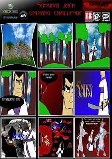
Looking at each comic mine is basic in quality but since I did mine in Photoshop it has a bit more visual coherence as you look at the X-men comic strip above they color is a bit more gritty but the content is more mature as you see X23 impale a character on her claws. The graphic atmoshpere helps add tension for the X-men as their story is based around the mutant race going extinct and humans wanting to finish them off and so the mutants are been hunted and terminated the visual style reflects that well as my comic uses gradients to help add a visual atmosphere and in each frame it is used in it helps make a focal point such as in frame six Jack unsheaths his sword I have added a word art with the sound effect "Snikt" which is commonly used in X-men when Wolverine unleashes his claws. That sound effect is very iconic in the comic industry as X-men is highly regarded and very prestigous. I tried to add atmosphere into my comic with inspiration from X-men as people are trying kill them because they are scared of their powers. With Jack samurais are scared to fight him and that samurais death reflects how stupid it si to run into the face of death with no regard for the consequences but I think he was trying to prove a point. Fear can be conquered.

The X-men understand this all too well as they fear that the mutant race will go extinct and that mutants and humans fight each other. The X-men believe that the two races can live in harmony, the concpet of harmony is seen in my comic at the start as Jack is meditating and everything is quiet.

Comparing the Storyboard to a professional example

I will do this in two stages: First a further character development skecth and then my storyboard.

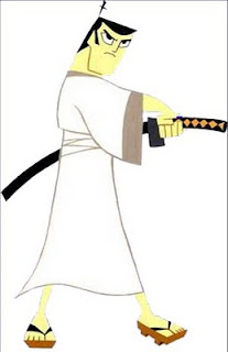
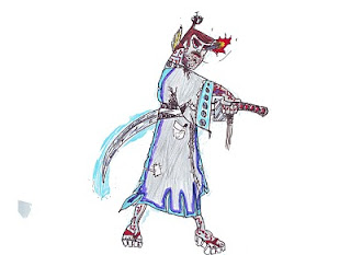
At the start of the unit wew were tasked with picking a character to do a storyboard on I chose Samurai Jack as he was a personal favourite of mine and looks easy to draw. So I found a reasonable picture to trace which I did. I made some few concept images with it then we were tasked to change the design so I made two different versions of Jack I did an Evil Jack with an appropiate design with a black and red robe to show a more sinister evil side of Jack and the second was a futuristic Jack. The design for this one was extraordinary as there were many physical and visual changes. My favourite part would be his sword as it has a protective aura which can deflect projectiles but also leaves a motion blur effect after he has used it.A very basic design but effective as the colours clash and the textures look reasonable. After completing Evil Jack I thought of going a bit wild with the design and as an end product I got the concept art of what a future Jack looks like. The Jack above (normal) was the one I traced from and putting them together the future Jack has more detail. Genndy Tartkovsky would be pleased.
Evaluation for my Unit 67 Game Trailer Storyboard part 7

Did you meet the Deadline?

I got the work done before the deadline as I have expereince in Photoshop I was able to complete it in time. The deadline was reasonable there was enough time to get the work done. I was efficient with the time given as I got everything complete before they were needed to hand in.

Did you have any problems with time management?

Not really as time given was easy enough to manage, I had three hours a week to get it done and also an hour for workshop was useful. When I was working ont he storyboard I wasn't reallly concerned with time as that put me off my work and make me worry about time management I acknowledged how much time I had.

If I had the oppurtuinity to make this product again would you do anything different?

I would actually as I would something more challenging I was considering to have a go at anime actually as thsi visual style is popular in Japan and I have some favourite anime such as Pokemon which I have liked since I was a child. Anime is much harder as the key word is exaggeration. The illustrations are physically deranged such as massive hair or a character wielding a sword which is twice his size. Also the main feature which I like about anime is the eyes as these are perfect as they are colored and are good in a visual quality.

Evaluation for my Unit 67 Game Trailer Storyboard part 6

Did you encounter any other problems.

Not really as the only problem I add was in Photoshop with the multiple layers. It was confusing as there was loads of them. There were layers everywhere and it was hard to selct which one I needed. I overcame this problem by putting them in order. Such as first ther layout then the scanned images then the color scheme and afterwards the backgrounds.

What have you learnt form this experience?

I have learnt that illustrations require patience and dedication. As drawings can't be rushed the furhter character development images were traced as that was the requirment to change the design of the character in different ways to manipulate the image in your eyes. I did this and made different themes for them. I learnt little from Photoshop as I already know the basic functions but I did know how to use gradients effectively and also how ot portay certain scenes in a sensitive manner such as death and harmony.

What skills have I developed?

I have developed my drawing skills a bit by practicing and tracing. As to keep your hand steady and help keep stability in doing so. Also how to broaden my mind when it comes to different ideas for characters such as stereotypes and cliches, such as Evil Jack with his red and black robe with his red eyes and balck hair this description is basic but it fits as those two colours are usually associated with evilness. Also in the first few frames I have given the impression of harmony as the sky reflects peace in its weather. The use of an atmosphere has been increased and adding tension has been improved.

Evaluation for my Unit 67 Game Trailer Storyboard part 5

Discuss the content / style of your work

I based my comic around Samurai Jack which was created by Genndy Tartakovsky who has worked on other numerous animation projects such as the Powerpuff Girls and Star Wars the Clone Wars ( the 2D version not the 3D). His legacy is well known as one of his famous aniamtions Dexters Laboratory is popular and well recognised.

I thought of basing the style of my comic around his illustrations as his animations are among my personal favourites considering I drew the story freehand it wasn't that far off. Genndys animation was popular throughout the late 1990's.

The content for my storyboard is basic as Jack is easy to draw as it is really more of a line image rather than a complicated illustration. Also I like the theme of Samurais as they are warriors from days past in Japan. Also the theme for Samurai Jack is based on Jack in different dimensions the worlds he visits are extraordinary and the character he interacts with are extraordinary. For my storyboard I thought what if Jack remained in Japan. Samurais are known to attack other samurais the intention was to highlight this point and Jack has to deal with it. Jacks a hero but he will go to the extreme if pushed hard enough.

Evaluation for my Unit 67 Game Trailer Storyboard Part 4

Discuss the aesthetic aspects of your work and the highlight strengths / areas to develop?

The visual quality of the storyboard is minor as this is my first official storyboard as I lack the experience in this sort of area, it was my first try. One area that can be improved is the hand drawn aspect of the stroyboard as some content does look a bit off.

Also the finished product does look better that I processed it through Photoshop. I think that the color and the gradient tool looks visually effective as they clash and help make the comic more visually enticing.

I also thint that the title scene at the top looks good as I have placed the Samurai Jack logo also I decreased the opacity to make it look transparent. Also the selection of images I used to express the theme further the mushroom cloud clearly expresses the thought of war and conflict. Also looking at the sky in the first few frames the atmosphere is ambient and there isn't much tension. The feeling is pecaeful until the enemy samurai comes to challenge Jack this is when the colour scheme gets a bit darker as it is help assissting in a harbinger effect. Peace is shattered when the enemy arrives it helps visually as his influence is shown in the last few frames were the background is dark and the apperance of Haunter is quite foreboding.

Overall I think the main area I need to develop is my hand drawn quality to help show more expressions in the characters and to also add physical detail such as wrinkles or facial hair just to name a few examples. To make them look more human I would say.


Evaluation for my Unit 67 Game Trailer Stroyboard part 3. continued

To continue with the storyboard I was given a basic storyboard with enough frames to start. Physically I drew the frames in total I did bout nine frames. After I hand drawn the storyboard I scanned them into photoshop when the appropiate layout was formed.

On the other hand I was getting the storyboard layout ready on Photoshop. For the frames I used two layers I made one small with a black background and behind I made another layer but I made it big enough that it gives a simple white outline with this I copied and pasted it eight times to create the amount of frames needed.

On the title section I used the font abbadon for the title and for the speech in the comic, also in the top left corner there is a small spot of white for that effect I used the gradient tool I used this multiple times in my storyboard as this can help create a dramatic effect or help add tension. I also added Jpeg images as this can also help create a visual satisfaction and help form or mold a theme.

My favourite frame would have to be frame eight as this shows the enemy samurai dead and shows plenty of blood, to express this I used multiple brushes to create this effect. There were much choice for this but I used a selected few. Also in the same frame I added an image of the Pokemon Haunter this image helps add darkness to the concept of death as his demeanor, the idea looks sinister and that was the idea I was going for.

Visually the first frame is in 3D but I added a transform tool to add a visual effect which in my honest opinion doesn't work as it is compacted and looks like it is imploding. Anyway the effect of 3D was based on the founding idea of the story in the forest it works as I used 3D Studio Max to create a scene and in that program there was pre-set foliage feature which hap a multiple selection of trees, to help keep the storyboard faithful to the source I added in Japanese Ceerry Blossoms and I also added Willows to help vary it. Also for the background for the top three frames I added a sky image to help it make it look more realistic.

Thursday, 10 June 2010

Evaluation for Unit 64, 65 Comparison

Example: Normandy from mass effect

I am going to compare how my ship compares to a professional example.

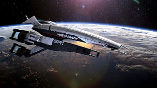
I have chosen the ship Normandy from Mass Effect

To look at a ship such as the Normandy is to look at perfection itself as this ship has been crafted by the geniuses at Bioware. Their legacy includes the games Baldur’s gate and Star Wars Knight of the Old Republic. Enough about that but since they have worked on a star wars game then they have knowledge on how to work with the sci-fi genre.

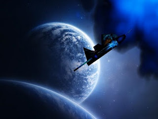
Just above is the ship that has been created by a team of professionals. The appearance looks realistic the texturing looks perfect as the metal texture looks real. The physical model has indents into the sides of the ship which show the wings joints. Also the scale of the ship is huge it has been crafted with delicate attention and sensitive eyes. It took them about two to three months to get this complete and the end result was worth it. The size of it looks standard and everything looks symmetrical and balanced.

My new ship took about two weeks to make then again this is my first official project so quality is not as good as the Normandy. My ship below is at a small size and the textures are of a crystal I thought something different might be better. My model looks of a decreased value placed next to the Normandy but the textures look agreeable as the finished render looks realistic. The shape of each ship is not the same of course as the Normandy was done by professionals and my ship was done by me. The inspiration for my ship was the Normandy as the ships tail had a specific animation for when the ship entered FTL (faster than light travel). My animation was basic but the transition was fluent just like when the Normandy is in flight. The visual quality of my ship isn’t that bad with the textures it has since my ship is compact the program had to strain the texture so it wasn’t as visually exciting as it was looking at the texture map. The bigger the ship the more attention you can give it and the more physical detail it can contain.
Evaluation for Unit 64, 65

What you enjoyed?

I enjoyed the creative process of this project, I was able to make different designs for a ship as the choice was a ship or a car and thinking about a car it is restricted to one design but a space ship can be different physically. I had hundreds of ideas for a ship such as it s shape its size and features such as weapons and armour. I created a mood board with different influences the general picture was a ship with offensive capabilities. I created my first ship and I realised there were many design flaws so I changed many because I realised that making such features will take up much attention and detail. I made a decision to make a new ship. Since I had such limited duration of time to do so I rushed it a bit and physically the ship was no better than my first one but the main physical flaw was removed my ship didn’t look like a basic box. Another thing I enjoyed doing was making a planet for my ship to orbit around I got a basic primitive sphere and I applied an ash texture to it and with some use of projecting lights I made the planet look like it was on fire. Also I found some pre-set foliage options which I used it made the planet more vibrant than it should be.


In general I enjoyed the whole experience but the thing I would like to most is to work with in depth particle effects and I know there are some as I have explored and used some such as in the new ships video its been chased by fire. I would like to create an explosion or work with the physics to work with planets gravity.


What you found difficult?

I found the animating difficult as this was my first official project I had no experience involved with animation. At first I made a basic animation of a ship orbiting a planet I worked upon this by making a video from a cameras view. Doing this was very difficult as the camera was very fiddly to work with and the end result was inadequate. Also the camera in its perspective view was annoying as I wanted to look at my model at a different aspect it denied me that and that was very frustrating. To be honest modelling was a bit difficult as their many tiny details that are physically wrong and changing them wasn’t much of a problem. Overall it wasn’t that hard to create a ship but what I found the most difficult was the lack of imagination.


What would you do differently?

I would do a ship with more complex physical attributes. To venture into the unknown and to create something new is a mystery itself. If I was to make a new ship I would make much bigger and give it more precise physical details. I would get one source of inspiration and stick to it rather than have too many ideas. One scheme is enough to make a perfect ship. While variety is a good thing so is practicality.

Creating a ship shouldn’t be hard it should be enjoyable. Given the chance I would work with only a few shapes to keep it simple but to focus on so little would be a big step. Otherwise another thing I would work with is a theme rather than make a ship form the future I might make another ship such as a stealth plane as this is modern and it is achievable and also it has simple textures which can be replicated very easily

What I have learned?

I have learnt a basic range of features in 3D Studio Max such as modelling and texturing. I have learnt that the main component the core of a design is imagination the more wild the more bizarre the design the more the possibility is better. Probability is considered as one design is not too simple every idea is malleable to an extent.

Also exploring further features I was able to learn about basic particle effect such as fire and weather conditions such as hail and rain. I have learnt how to unwrap objects to use as a map for a ships physical appearance. The process known as UVW Unwrapping was difficult at first but listening to the tutor he explained like it’s a giant jigsaw that you have assemble piece by piece. This translated into finding the pieces working with them and then putting it back together. His advice aided greatly as the textures I did were perfect even though the physical quality of my ships aren’t the best. I have learned that to start again is to have a clean page which can be used for new ideas. Know this creating a ship might be difficult but patience can result in detail and progression. If I could start again I would make a ship more bigger rather than a fighter plane I would make a ship identical to ones I see in games such as the Normandy in the game Mass Effect.

In Studio Max I was able to explore the options available and found that new tools would help give my ship a visual advantage.

Tools used:

Basic primitives

Lights

Camera

Auto Key

Timeline

UVW Unwrap

Editable Mesh

Material Editor

Photoshop (for the textures)

Evaluation for Unit 64,65 basic outline

For my Unit 64, 65 work I had to develop an object I had the decision of a car or a spaceship, I decided to go with a spaceship as with this I am able to explore my imagination for different styles of ships. When I started I created a mood board to help with the design I looked at multiple examples of well known ships in the sci-fi genre and also alien vehicles.

After a bit of research I drew up some designs for my ship originally it was to have a crystal on the back to be its fuel source but I thought about that and it would be hard to model and the texture would be a bit hard to do so I got rid of that the main structure was just a box with wings and the front of the ship was slanted down to make way for a cockpit. I did some concept art at different angles such as top, left and front and side. I looked at the design again and made some more changes such as the appendages I originally designed.

Now I started to work on the 3D model itself it took about three weeks to make but it was similar to the original design. After that I started to work with texturing. I changed the model to an editable mesh and this helped me in the construction stages. I used the UVW Unwrap modifier which helped me make a blue print of the ship. Given that it was simple once explained so I unwrapped it and made a suitable outline for what the ship could look like I placed the blueprint into Photoshop and after some image manipulation I created a metal texture with a hint of beige I think.

Also as part of the texturing I have placed some popular images on my ship on the side I placed the Ghostbusters logo and at the bottom of the ship I placed Han Solo frozen in carbonite. After texturing I managed to create an animation which had the ship following a line that circles around a planet I made. It was basic really.

I grew tired of my old ship so I created a new one. This new ship would be better. Since I started again it took me a week to make it because of this time lapse it is of a really basic design. This was a good thing as I could do new textures for the body I used a recycled crystal texture that I made. Also unwrapping the new ship was easy because I had some experience with texturing I manipulated the new ship and placed some unusual pictures on it. I used a brush on Photoshop in the shape of a symbol and I placed on the front I also found an image of a phoenix which I used.

For the animation of the new shop I practiced using some particle systems such as fire and glowing lights with some practice I managed to make the ship been chased by fire. I would use a camera for the animation but I am not really experienced in that area.

The influences I had for the old ship was for the appendages the tripods of The War of The Worlds as I thought that having a ship with limbs could be good visually. For the shape of the ship I looked at the game Mass Effect which is a sci-fi game the ship in that is called the Normandy. Since my old ship was obviously the shape of a box I abandoned it and made a new one and since I rushed the new ship I wasn't able to produce a good quality ship but the texture it had was good as I created it myself.

Brand New Ship


I grew bored with the last ship I had so I decided to make something new.

This new ship is much better than the old one as I was able to make new textures and some new animations.

Wednesday, 9 June 2010

Evaluation for my Game Trailer Storyboard Part 3 Continued

Discuss the technical aspects of your work and highlight the strengths / areas to develop?

I my previous post I discussed my skecthes for Jack, what I did next was to make a written narrative for the story and to do research on a suitable comic layout I opted for something basic for the layout I decided to use nine frames for the storyboard.

Now my work on Photoshop begins I made a rough example layout (which I saved over), this was the foundation for the storyboard to be worked upon. For each frame I used multiple layers to work with I made a practice frame for which I put my 3D scene into it, if you look at it now the frame is warped that was a bit of practice with a transform tool. For the other frames I duplicated each of them so the height and lentgh of each frame should be the same. For the title layer I added a gradient effect to make it look more appealing than a basic title.

For other features I implemented many images to help make it look real the clouds are noticable in the first few frames.

On more of a technical side I used many tools features in Photoshop most commonly the brush tool to help color many blank spaces in the stroyboard, I also used the ruler tool as this helped me put each frame in a neat order to make everything suitable.

Evaluation for my Unit 67 Game Trailer Stroyboard part 3.

Discuss the technical aspects of your work and highlight the strengths / areas to develop?

For the production of the storyboard I drew some further character development skecthes which helped me get an idea for what Jack could do. In mind this was just a harbinger for me as I went on to develop more skecthes of Jack in different a different appearnce and color scheme. Jack with a red and black robe is evil Jack I got the idea for this as an oppsite of good Jack I gave him a simple color scheme to match his evil intent. For a third edition I gave Jack a futuristic design this gave me the chance to work with options I haven't yet fully explored.

Evaluation for my Game Trailer Story board Part Two

Is the end product suitable for my intended audience?

I think so as my intended audience is young adults and upwards as the storyboard does contain some graphic content which can be inappropiate for a young audience. My storyboard is not meant to divide its audience into groups based on age or race, I would like my storyboard to be enjoyed by people of all ages (just as long they can mind a little blood).

Also I would like my storyboard to be enjoyed by an audience of Samurai Jack fans as he does have a large fanbase.

In my storyboard there is some inappropiate imagery as in one frame a mushroom cloud can be seen this can be reminscent of World War Two and for the atomic bomb. Seems I should have used a different image for that as if the effect of WW2 can be felt today. Swords are inappropiate as Jack uses his to kill his opponent in the second to last frame there is a lot of blood shown and an image of Haunter the Pokemon which I included the reason I applied his image because he adds to the atmosphere of a death, sticking to the theme of death was important as I wanted to pertray this as a moment of clarity.

I based my storyboard on no age as I didn't want any of the audience to feel discriminated as the aim for his comic is to be enjoyed by a large audience of people. I made an effort to stay away from one particular audience though, young children as they are delicate matter when it comes to adult content. Finding ways to go around this was difficult as a course of action was to have material which wasn't revealing but faithful to the source.

Honestly though Samurai Jack was broadcasted on Cartoon Network which is popular with a young audience I was young when I watched Samurai Jack for my storyboard I wanted to show him form a different perspective in his Animation he didn't kill any humans, he killed aliens robots etc. I worked around this and based it on a Samurai theme. Rival clans fighting each other was a common sight when Samurais were a turning point in Japans history.

The other ideas I had for characters which I was going to use for my storyboard was a specific Pokemon in this case if I went with this idea the target audience would have greatly expanded as Pokemon is popular worldwide. Every race, gender and age love this as Pokemon have a large collection of interactive features about it such as games and an anime series.

Evaluation for my Unit 67 Game Trailer Storyboard Part One

This is my finished storyboard for my Unit 67:


Does the end product match my intentions?

I can answer this without a regret as I made this comic myself I shaped this within my mind and it matches my intentions definitley. At the beginning of this project I was curios as to which charatcer I would choose for further development, I mulled it other with a few choices but in the end I chose Samurai Jack as it is one of my favourite childhood cartoons and also easy to draw.

Afterwards I researched into comic layouts and been a fan of comics and graphic novels myself I bought my own comics from home to research on. To make it more personal I chose my favourite series X-men which is done by Marvel and I rserached into many comics and graphic novels done by Alan Moore most notable Watchmen and V for Vendetta. When Alan worked with Marvel he write Civil war which is my favourite stroyline and also memorable as it led up to Captain Americas assassination.

The comic extract was from the X-men stroyline Second Coming I tried to fit the grim style and deathly atmosphere into my storyboard as someone dies and I dedicated a frame to his death I hope the style is suitable I know the visual quality isn't very good but then it was my first comic that I have done.