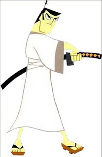
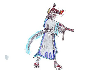
At the start of the unit wew were tasked with picking a character to do a storyboard on I chose Samurai Jack as he was a personal favourite of mine and looks easy to draw. So I found a reasonable picture to trace which I did. I made some few concept images with it then we were tasked to change the design so I made two different versions of Jack I did an Evil Jack with an appropiate design with a black and red robe to show a more sinister evil side of Jack and the second was a futuristic Jack. The design for this one was extraordinary as there were many physical and visual changes. My favourite part would be his sword as it has a protective aura which can deflect projectiles but also leaves a motion blur effect after he has used it.

 A very basic design but effective as the colours clash and the textures look reasonable. After completing Evil Jack I thought of going a bit wild with the design and as an end product I got the concept art of what a future Jack looks like. The Jack above (normal) was the one I traced from and putting them together the future Jack has more detail. Genndy Tartkovsky would be pleased.

No comments:
Post a Comment