With agreements put aside we have confirmed in what roles we are all playing for the creation of the game trailer. Myself I have a important role to play as I am making one of the key characters and locations vital to the narrative. On this post I will cover what I am creating and what the rest of the team are planning to do.
Character: As I have thought about a potential chaarcter I came across the idea for a game with the use of the horror genre and I thought what was the most horrific thing I have seen and felt. For a while I thought that the most underused pure form of terror and horror was the haunting expression of a child. A direct influence I looked at was the game FEAR who the main antagonist was a character called Alma, she was a child who had shown signs of psychic potential and so she became a subject and was tested so on and so forth he test failed and she became twisted and very absent minded. Now the influence from Alma is that she sends psychic projections to the main character and you can see Alma as a young girl. My perception of the Alma (child) was superb as that the expression and demeanor truly showed horror and the atmosphere suddenly became grim and solemn. That feeling is what I want to portray in my character. Now my character who I call Mercy is the fifth iteration in a long going experiment as her predecessors failed. To derive from the character description and I will move on to the program details for a moment.
The program itself developed by a secret military was to create a weapon to be used against their enemies or to be used as an intimidation tactic, the progrmas origin was fortified when an expedetion funded and done by the military itself found an Aztec temple in an isolated forest not seen by the eyes of men for the past few centuries. I know what your thinking a temple in a forest let me remind you this is a game trialer and it doesn't have to make sense. Anyway within this pyramid is what they were looking for an ancient demonic entity that has been dormant for many centuries. The purpose fo the pyramid was to keep the demon entombedand the aztecs made blood sacrafices to keep the demon calm, but with the spanish colonization of the americas it stopped. Now the demon is slowly waking. Back to the program, the purpose was to create a weapon as I sadi and the demon is the genetic source of the weapon. Scientists acquired some the demons essence or DNA and applied to a zygote. With further genetic engineering by the scientists the zygote grew into a fetus and then soon to a child. A reaction happened every time with the application of the demons esscence the prescence of said essence dominated the zygote and unique traits were formed such as the child was always female, the potential shown by the demons essence and also the genetic engineering by the scientists made the subjetcs powerful. The potential showed in each subject was too advanced for the child to contain and when the child reached the age of twelve the "connection" was implemented. This part of the experiment was when the demon tried to connect with the child and unlock latent abilities in the childs potential. The downside was that each instalment in the program series was under developed and not trained to an acceptable degree for them to survive the connection.
This is where my character comes in, she is subject five the process was done. The application to the zygote the nine month conception, birth and then growth. Theres a difference between this subject as she has developed too well she has progressed training to maxium levels and has shown an extreme tolerance to the demons presence. When the connection happened she survived as her skills, abilities and resolve have grown too well. Since the connection failed her abilities have unlocked and she now has more power at her command but of course this power originated from this demon, there is a side effect of survival the demons presence is stronger and has become physically shown. Subject five with her potential unlimited overpowered the connection and the presences strength is now hers and with power she has become corrupted and that has become visible in her appearance. After the connection she has recognised her purpose, she is a weapon and her resolve has become twisted as she wants to have more power and to do that she has to break free from the demons presence and attention and to do that she has decided to kill her farther.
Wednesday, 1 December 2010
Thursday, 25 November 2010
Fog Effect
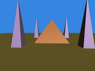
In the latest tutorial I was taught how to add atmospheric effects more specifacally a fog effect, I started with making a Pyramid with some spires at each corner.
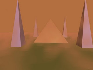
As you can see the first image is without the fog effect but th eone inderneath shows the fog effect, with specific controls I am able to add layers of fogs on top of each other. Since this is in a desert I went with a brown fog which is supposed to look like dust in the wind.
 Also I have added a lighting effect to the scene whilst also tinting the sky to a night scene.

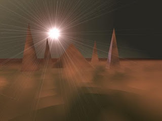
 And just below I have applied a lighting effect as it looks like the sky is practically been torn apart.


As you can see the first image is without the fog effect but th eone inderneath shows the fog effect, with specific controls I am able to add layers of fogs on top of each other. Since this is in a desert I went with a brown fog which is supposed to look like dust in the wind.

 Also I have added a lighting effect to the scene whilst also tinting the sky to a night scene.
 And just below I have applied a lighting effect as it looks like the sky is practically been torn apart.
Wednesday, 10 November 2010
Environment Moodboard
Here I have done a moodboard dedicated to the environment of the Final Major Project:
The inspiration derive from multiple sources:
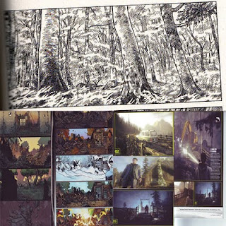
Since the game trailer is based in a forest I have looked at the game Alan Wake for inspiration as this has the perfect setting. As the game has elements of phschological situations. I would like to portray this in the trailer as it has factors of fear inside it. For the image on the bottom left it has depictions of an abandoned building when actually it is the X-Mens mansion as this picture was taken from the second-coming storyline, the point why I chose this picture was that it shows the building abandoned and surviving through the seasons this is inspirational as I could set the environment in a winter setting. For the image at the top the source is from the manga Claymore what I like about this is that the source is varied and I am looking at different alternatives for inspiration and also the image itself is nothing but trees as this can be a direct reference.
The inspiration derive from multiple sources:
Since the game trailer is based in a forest I have looked at the game Alan Wake for inspiration as this has the perfect setting. As the game has elements of phschological situations. I would like to portray this in the trailer as it has factors of fear inside it. For the image on the bottom left it has depictions of an abandoned building when actually it is the X-Mens mansion as this picture was taken from the second-coming storyline, the point why I chose this picture was that it shows the building abandoned and surviving through the seasons this is inspirational as I could set the environment in a winter setting. For the image at the top the source is from the manga Claymore what I like about this is that the source is varied and I am looking at different alternatives for inspiration and also the image itself is nothing but trees as this can be a direct reference.
Outside Sketches
I have for some time done some sketches at home which I draw in my spare time, I really like the manga style of illustrations and hopefully in the future I will be able to draw much better than I can do now.


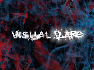
Team logo final descison and why.
Out of all the logos the team have we have finally decided on the team logo:
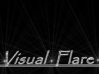
1. Dom's logo - Chosen logo.
1. Dom's logo - Chosen logo.
What I like about this logo is the design of it as it is very impartial for what I have forseen as a suitable team logo. The name really does suit this design well as there is the evidence of a flare as there is a colourful smoke as the effect looks very realistic. The logo is very visual as the font has effects such as glowing and the font of the words really do stand out. Overall this is what I call a proffesional industry standard logo.
UPDATE:
Dom's logo was voted (by the class) as the final team logo. Out of all the team members he recieved ten votes as he had the most, the final logo has been decided.
Monday, 8 November 2010
Environment Designs
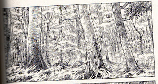
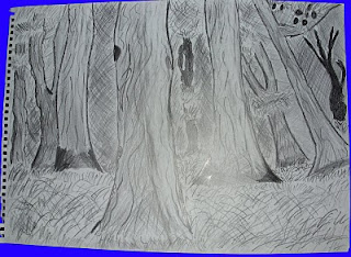
For the environment I have chosen a suitable theme that goes well with the game trailer. For my official design I have gone for a simplistic view of a forest. I have left the image as a line drawing as I have applied extra solidarity with a fineliner to help make lines look extra bold. Also I have added extra shading to help ut the emphasis on scale as the trees closer to the front of the image are more vivid with texture and shading contrast. For the refrence image I have taking that from the Claymore Manga, another reason I kept that image in black and white as it is an acknowledgement to the source. Since I will make this in 3D this environmetn is very possible as the image is in constant contrast with scale, textures and lighting. This is a perfect image to look upon for inspiration
This is the refrence image:
This is my official environemt for the game trailer:
But I have explored further development with a different design with a different creative approach. I have gone for an abandoned building in the midst of winter. Gain for a genreal impact I have gone for a fineline effect and also to show a different visual effect I have used four different art techniques. I divided the image into four parts with each section dedicated to different styles. For the top left I have used pencil crayons to help display what creation could appeal. The colours contrast well as the tree has a rugged texture which helps it looke more realistic. Also felt tip pens feature in the practice image which helps add contrast to the image but overall it is quite appaling with the colour scheme on the other hand it is bold and has a lot of clarity. For the bottom right of the image I have used pastels since snow dominated this section I experimented with different shades to help it make look vivid and detailed, the use of pastel helped the image look a bit more 3D as the blood splatter looks realistic and the blue tint in the snow piled up against the wall looks far superior to any other detial in the image. What I liked about the pastel that it is very easy to apply to an image and also simple to manipulate with the technique of shading and texturing. If I decide to use snow in the game trailer I will definitley look at this for an idea. For the bottom left I have left it as a pencil drawing as I didn't want to cause more damage to the image. Overall, I am happy with what I have done for the experimental design.

This is the refrence image:

This is my official environemt for the game trailer:

But I have explored further development with a different design with a different creative approach. I have gone for an abandoned building in the midst of winter. Gain for a genreal impact I have gone for a fineline effect and also to show a different visual effect I have used four different art techniques. I divided the image into four parts with each section dedicated to different styles. For the top left I have used pencil crayons to help display what creation could appeal. The colours contrast well as the tree has a rugged texture which helps it looke more realistic. Also felt tip pens feature in the practice image which helps add contrast to the image but overall it is quite appaling with the colour scheme on the other hand it is bold and has a lot of clarity. For the bottom right of the image I have used pastels since snow dominated this section I experimented with different shades to help it make look vivid and detailed, the use of pastel helped the image look a bit more 3D as the blood splatter looks realistic and the blue tint in the snow piled up against the wall looks far superior to any other detial in the image. What I liked about the pastel that it is very easy to apply to an image and also simple to manipulate with the technique of shading and texturing. If I decide to use snow in the game trailer I will definitley look at this for an idea. For the bottom left I have left it as a pencil drawing as I didn't want to cause more damage to the image. Overall, I am happy with what I have done for the experimental design.

Thursday, 21 October 2010
Moodboard for Game Trailer
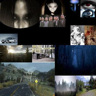
We all have agreed to make a horror game for our game trailer. We have a narrative in mind that involves a sinister and supernatural atmosphere to it. So we created a mood board to put emphasis on our influences. Since our plot had children as the villains I thought on how I can expand on that and how that idea can come across as a serious concept. In our plot the children are poseesed by a demon and so for any physical traits such as ragged clothes, pale complexions. What I would like to do myself I would like to show the taint of the demons possession with one of the ultimate concepts. Glowing eyes can show a lot corruption or moral allingment.
For my inspiration I have looked at games such as FEAR and Alan Wake. Since the narrative takes place in a forest setting I have looked at Alan Wake as this is a perfect example evil lurking in the dark. For FEAR the mian antagonist is a person called Alma who is a psychic who has been manipulated and engineered. She goes on a rampage etc. the influence from her is that she has a child form which has an apperance in what I am looking for.
Thursday, 14 October 2010
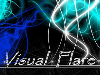
Team Logo Designs
Since our team name consists of the word flare we thought that would an exceptional idea to help with a logo. We all made indivdual designs. The logo was created in Photoshop and for the flare design I used a glowing brushto help emphasise the flare aspect as they are known for having bright, vivid colours. On our moodboard there are multiple images that explore the concept of colours and patterns. For the dark cicular glow effect in the back I used a lens flare effect.
Here are mine: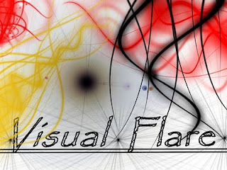
Here are mine:


My Ideal Genre for Trailer
For my Final Major Project, we will make a game trailer but we need ideas for what theme/genre we can have.
Here are some ideas:
1.Horror: For this we will have a character walk through a forest, been watched by a monster. But how this will work. We will use the full effect of camera angles such as viewing the character from the side. Also the use of audio we will use a noise/music to add tension. The ending will see the character been chased or attacked by the monster, Atmospheric. An influence could include Resident Evil and FEAR. Very cinematic.
2.Mystery: The idea for this is self explanatory, a setting would be seen in First Person. An idea would be the user walking down a corridor looking into rooms were the interior design will be individually designed by each team member. Also to add to an haunting feeling I will make a character that might walk on the roof while you walk down the corridor.
Other Concepts:
Art Style: My influenced artstyle would be realistic, as I feel that a cel-shaded forest wouldn't give a solemn expression. An anime design might work but I don't really know how to do that. Since the narrative is of the horror genre, having the art style will help put it in tune. I might look at specific gothic styles of visuals. As the forest will be dark and gloomy.
Characters/Creatures: Since we are going with the horror genre, I think that an acceptable character would of a young age round about 18-23. For a creature I am thinking of having a supernatural creature or another human e.g. pyscho, clown.
Weaponary/Vehicles: Weapons might be optional dependign if the villain is a pyscho. A blood soaked knife might help.
Background/environments: My idea would be a night forest background as this could put emphasis on the horror genre. The forestry would be influenced from Lord of the Rings such as the Mirkwood Forest where Saurons influence could be seen. A perfect setting would be able to see the forest as solemn and isolated. Since the environment looks tainted with evil I could use a fog effect to help emphasise the genre. In the game Fable 2 a section is called Wraithmarsh where it is a dark forest with a fog floor and you can see deserted buildings and destroyed buildings.
Wednesday, 29 September 2010
Concept ideas
This is the base design for our logo as we agreed that we should make an individual design and then combine and vote to see what the team logo can be. We developed the wording and glow features in 3D Studio Max. Afterwards we will make a certian amount of individual designs.
For the fotn we decided to use a pre-set font as we scanned through the different styles I noticed a font that seemed familiar, and after simulating what it may look like we decided to use the Papyrus font, for the viewers it may look familair (its the font of Avatar)
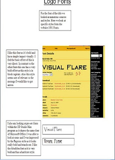
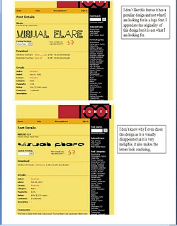

For the fotn we decided to use a pre-set font as we scanned through the different styles I noticed a font that seemed familiar, and after simulating what it may look like we decided to use the Papyrus font, for the viewers it may look familair (its the font of Avatar)


Moodboard
We constructed a moodboard to help inspire us with our designs. When we were looking for ideas and scoured through boooks for original source material. We looked through books that were relevant for our cause.
We looked through books that held siginifigance, for a major source we looked at a book that held pages of how colours combined can look effective as there are different tones and shades. Also for a general definition for a logo design we looked at logos that already existed. We also looked at images that had visual effects such as adverts or photos. One of my favourites was a random photo with a tiled space invader that was inspirational at is unexpected in such an environment. Also we put emphasis on shapes as freqyuently we have images that have base shapes and also some images that have a 3D effect.
We also looked at logos form current games studios today as we have analysed companies such as Lionhead Studios, Bungie and Codemasters. I feel that the moodboard has really affected our creative guessing as we are anticipatiing what logo we can make but we all know that the logo should match the name. Expect bright, flourescent designs.

Brainstorm
We made a brainstorm to help collect and collate ideas for a potential logo design. We donconstructed our task and made areas of what is needed for a logo. Such as colour, font and shapes. This was a simple look and review so we can stick to our assingments.
As we set out our brainstorm we started the most general information Team memebers was confirmed. Then to more important the design of the logo we all agreed was that it had the name Flare then we would nedd some design of bright colours, something vivid.
We comprised the design with one simple shape, we based the logo on a rectangle but we had it coloured black so the flare colours would stand out. For the main colour scheme we thought would colours would contrast well, so we considered all the bright colours possible to white, light blue, red and yellow.
For font we decided that we want to use somethign simple and old, we looked through pre-set fotns and we decided on the Papyrus font which is famous for been the Avatar font. For features we wanted the name to glow so we thought of a possible design to show how flourescent it could be.

Thursday, 23 September 2010
Sky Boxes
Today I had a practice at making a suitable sky for our environment, a skybox.
I had a choice a box or a geosphere. I chose geosphere.
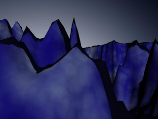
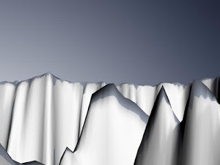
I converted it to a editable mesh and scaled it so it engulfed our environment and with the excess faces I deleted them. Since the faces were faced away from the landscape I activated normal which shows the direction of where the faces are facing. I pressed Ctrl + A to earn the option to flip them all, and then I created a texture for the sky box. I wanted to create a cel-shaded sky so I made it look as bright and vivid as possible. The one on the bottom looks like a antartic environment.
I had a choice a box or a geosphere. I chose geosphere.
I converted it to a editable mesh and scaled it so it engulfed our environment and with the excess faces I deleted them. Since the faces were faced away from the landscape I activated normal which shows the direction of where the faces are facing. I pressed Ctrl + A to earn the option to flip them all, and then I created a texture for the sky box. I wanted to create a cel-shaded sky so I made it look as bright and vivid as possible. The one on the bottom looks like a antartic environment.


Thursday, 16 September 2010
Official LandscapeRender
Today, we started to learn how to create environments using a simple method.
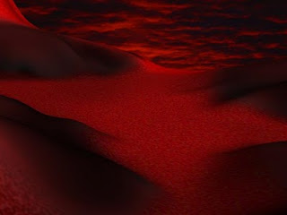
First of all I accessed photoshop and studio max in tangecent. For our Photoshop document I requried the canvas height and width to 512 and 512 and for the screen resolution I set to 72 DPI. What I did first was set the background black and then I created a white sections which lead to the centre and to the edge which the colour tone became brighter. Then I used the smudge tool to manuipulate the different shades and made them interact and correspond with each other.
Then I added layer and made this the ground part of my landscape in this case red grass. I filled in the parts which was darkest and I maintained the shape by filling the black empty areas and this became the valley. I added a filter effect Noise as this helped make the grass look more visually effective. I toned down the noise as it looked to multicolored.
Then I added one more layer as this would be the color of the stone which would be of the mountain. I used a darken color effect to make the stone look tainted by the color of the grass. For the final layer this would be the peak of the mountain I wanted to make this look like a blood snow effect so I had the color of the snow a bright red with a mix of white and I added another Noise effect to help make it more visually real.
I opened up Studio Max, I used the Plane standard primitive and gave it 100 lentgh and 100 width segments. I added a displace modifier and I gave it my displace texture. Then I added the dsplacement strength which totalled up to 61. I also added a blur effect to make the surface more smooth. Then I added a background which was of a dawn sky which looks like its on fire.

Wednesday, 7 July 2010
Thursday, 1 July 2010


Thursday, 17 June 2010
Environment Practice
I had some practice with creating some environments, with this one I designed a scorched earth environment. With this environment I have added some fireball effects to go along with it the Blue stone bulding was supposed to be a crystal texture but you can't unwrap a standard primitive.


Wednesday, 16 June 2010
Comparing the Storyboard to a professional example continued
Now I will compare the storyboard itself.
Myself I am a big fan of comic books and graphic novels and manga. One of my personal favourites is the comapany Marvel which a a large pantheon of charatcers such as Spider-man, X-men, Captain America, Iron Man and Teh Incredible Hulk etc. My personal favourite is X-men as currently I am following The Second-Coming stroyline.
Anyway my storyboard is a baisc simple design with a basic layour of nine frames placed next to and on top of each other. This sort of layout can be found in any comic book. Since this is my first officail project it was hard to sort the layout in Photoshop was a bit difficult as placement was a bit tedious and the measurement had to be correct. Also the way I colored my comic is different to how experts do it I painted mine in Photoshop and experts paint theres with their own hands.
The beauty is that the art the do is impressive as there individuals to deal with each part such as the artist, the inker and the colorer. One of my favorite artist is David Finch who did a superb contribution to The Fallen Son one-shot (this deals with characters reaction on Captain America Assassination).
Looking at each comic mine is basic in quality but since I did mine in Photoshop it has a bit more visual coherence as you look at the X-men comic strip above they color is a bit more gritty but the content is more mature as you see X23 impale a character on her claws. The graphic atmoshpere helps add tension for the X-men as their story is based around the mutant race going extinct and humans wanting to finish them off and so the mutants are been hunted and terminated the visual style reflects that well as my comic uses gradients to help add a visual atmosphere and in each frame it is used in it helps make a focal point such as in frame six Jack unsheaths his sword I have added a word art with the sound effect "Snikt" which is commonly used in X-men when Wolverine unleashes his claws. That sound effect is very iconic in the comic industry as X-men is highly regarded and very prestigous. I tried to add atmosphere into my comic with inspiration from X-men as people are trying kill them because they are scared of their powers. With Jack samurais are scared to fight him and that samurais death reflects how stupid it si to run into the face of death with no regard for the consequences but I think he was trying to prove a point. Fear can be conquered.
The X-men understand this all too well as they fear that the mutant race will go extinct and that mutants and humans fight each other. The X-men believe that the two races can live in harmony, the concpet of harmony is seen in my comic at the start as Jack is meditating and everything is quiet.
Myself I am a big fan of comic books and graphic novels and manga. One of my personal favourites is the comapany Marvel which a a large pantheon of charatcers such as Spider-man, X-men, Captain America, Iron Man and Teh Incredible Hulk etc. My personal favourite is X-men as currently I am following The Second-Coming stroyline.
Anyway my storyboard is a baisc simple design with a basic layour of nine frames placed next to and on top of each other. This sort of layout can be found in any comic book. Since this is my first officail project it was hard to sort the layout in Photoshop was a bit difficult as placement was a bit tedious and the measurement had to be correct. Also the way I colored my comic is different to how experts do it I painted mine in Photoshop and experts paint theres with their own hands.
The beauty is that the art the do is impressive as there individuals to deal with each part such as the artist, the inker and the colorer. One of my favorite artist is David Finch who did a superb contribution to The Fallen Son one-shot (this deals with characters reaction on Captain America Assassination).


Looking at each comic mine is basic in quality but since I did mine in Photoshop it has a bit more visual coherence as you look at the X-men comic strip above they color is a bit more gritty but the content is more mature as you see X23 impale a character on her claws. The graphic atmoshpere helps add tension for the X-men as their story is based around the mutant race going extinct and humans wanting to finish them off and so the mutants are been hunted and terminated the visual style reflects that well as my comic uses gradients to help add a visual atmosphere and in each frame it is used in it helps make a focal point such as in frame six Jack unsheaths his sword I have added a word art with the sound effect "Snikt" which is commonly used in X-men when Wolverine unleashes his claws. That sound effect is very iconic in the comic industry as X-men is highly regarded and very prestigous. I tried to add atmosphere into my comic with inspiration from X-men as people are trying kill them because they are scared of their powers. With Jack samurais are scared to fight him and that samurais death reflects how stupid it si to run into the face of death with no regard for the consequences but I think he was trying to prove a point. Fear can be conquered.
The X-men understand this all too well as they fear that the mutant race will go extinct and that mutants and humans fight each other. The X-men believe that the two races can live in harmony, the concpet of harmony is seen in my comic at the start as Jack is meditating and everything is quiet.
Comparing the Storyboard to a professional example
I will do this in two stages: First a further character development skecth and then my storyboard.
At the start of the unit wew were tasked with picking a character to do a storyboard on I chose Samurai Jack as he was a personal favourite of mine and looks easy to draw. So I found a reasonable picture to trace which I did. I made some few concept images with it then we were tasked to change the design so I made two different versions of Jack I did an Evil Jack with an appropiate design with a black and red robe to show a more sinister evil side of Jack and the second was a futuristic Jack. The design for this one was extraordinary as there were many physical and visual changes. My favourite part would be his sword as it has a protective aura which can deflect projectiles but also leaves a motion blur effect after he has used it.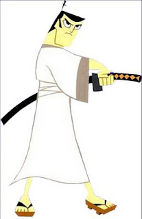
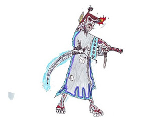 A very basic design but effective as the colours clash and the textures look reasonable. After completing Evil Jack I thought of going a bit wild with the design and as an end product I got the concept art of what a future Jack looks like. The Jack above (normal) was the one I traced from and putting them together the future Jack has more detail. Genndy Tartkovsky would be pleased.
At the start of the unit wew were tasked with picking a character to do a storyboard on I chose Samurai Jack as he was a personal favourite of mine and looks easy to draw. So I found a reasonable picture to trace which I did. I made some few concept images with it then we were tasked to change the design so I made two different versions of Jack I did an Evil Jack with an appropiate design with a black and red robe to show a more sinister evil side of Jack and the second was a futuristic Jack. The design for this one was extraordinary as there were many physical and visual changes. My favourite part would be his sword as it has a protective aura which can deflect projectiles but also leaves a motion blur effect after he has used it.

 A very basic design but effective as the colours clash and the textures look reasonable. After completing Evil Jack I thought of going a bit wild with the design and as an end product I got the concept art of what a future Jack looks like. The Jack above (normal) was the one I traced from and putting them together the future Jack has more detail. Genndy Tartkovsky would be pleased.
Evaluation for my Unit 67 Game Trailer Storyboard part 7
Did you meet the Deadline?
I got the work done before the deadline as I have expereince in Photoshop I was able to complete it in time. The deadline was reasonable there was enough time to get the work done. I was efficient with the time given as I got everything complete before they were needed to hand in.
Did you have any problems with time management?
Not really as time given was easy enough to manage, I had three hours a week to get it done and also an hour for workshop was useful. When I was working ont he storyboard I wasn't reallly concerned with time as that put me off my work and make me worry about time management I acknowledged how much time I had.
If I had the oppurtuinity to make this product again would you do anything different?
I would actually as I would something more challenging I was considering to have a go at anime actually as thsi visual style is popular in Japan and I have some favourite anime such as Pokemon which I have liked since I was a child. Anime is much harder as the key word is exaggeration. The illustrations are physically deranged such as massive hair or a character wielding a sword which is twice his size. Also the main feature which I like about anime is the eyes as these are perfect as they are colored and are good in a visual quality.

Evaluation for my Unit 67 Game Trailer Storyboard part 6
Did you encounter any other problems.
Not really as the only problem I add was in Photoshop with the multiple layers. It was confusing as there was loads of them. There were layers everywhere and it was hard to selct which one I needed. I overcame this problem by putting them in order. Such as first ther layout then the scanned images then the color scheme and afterwards the backgrounds.
What have you learnt form this experience?
I have learnt that illustrations require patience and dedication. As drawings can't be rushed the furhter character development images were traced as that was the requirment to change the design of the character in different ways to manipulate the image in your eyes. I did this and made different themes for them. I learnt little from Photoshop as I already know the basic functions but I did know how to use gradients effectively and also how ot portay certain scenes in a sensitive manner such as death and harmony.
What skills have I developed?
I have developed my drawing skills a bit by practicing and tracing. As to keep your hand steady and help keep stability in doing so. Also how to broaden my mind when it comes to different ideas for characters such as stereotypes and cliches, such as Evil Jack with his red and black robe with his red eyes and balck hair this description is basic but it fits as those two colours are usually associated with evilness. Also in the first few frames I have given the impression of harmony as the sky reflects peace in its weather. The use of an atmosphere has been increased and adding tension has been improved.
Evaluation for my Unit 67 Game Trailer Storyboard part 5
Discuss the content / style of your work
I based my comic around Samurai Jack which was created by Genndy Tartakovsky who has worked on other numerous animation projects such as the Powerpuff Girls and Star Wars the Clone Wars ( the 2D version not the 3D). His legacy is well known as one of his famous aniamtions Dexters Laboratory is popular and well recognised.
I thought of basing the style of my comic around his illustrations as his animations are among my personal favourites considering I drew the story freehand it wasn't that far off. Genndys animation was popular throughout the late 1990's.
The content for my storyboard is basic as Jack is easy to draw as it is really more of a line image rather than a complicated illustration. Also I like the theme of Samurais as they are warriors from days past in Japan. Also the theme for Samurai Jack is based on Jack in different dimensions the worlds he visits are extraordinary and the character he interacts with are extraordinary. For my storyboard I thought what if Jack remained in Japan. Samurais are known to attack other samurais the intention was to highlight this point and Jack has to deal with it. Jacks a hero but he will go to the extreme if pushed hard enough.
Evaluation for my Unit 67 Game Trailer Storyboard Part 4
Discuss the aesthetic aspects of your work and the highlight strengths / areas to develop?
The visual quality of the storyboard is minor as this is my first official storyboard as I lack the experience in this sort of area, it was my first try. One area that can be improved is the hand drawn aspect of the stroyboard as some content does look a bit off.
Also the finished product does look better that I processed it through Photoshop. I think that the color and the gradient tool looks visually effective as they clash and help make the comic more visually enticing.
I also thint that the title scene at the top looks good as I have placed the Samurai Jack logo also I decreased the opacity to make it look transparent. Also the selection of images I used to express the theme further the mushroom cloud clearly expresses the thought of war and conflict. Also looking at the sky in the first few frames the atmosphere is ambient and there isn't much tension. The feeling is pecaeful until the enemy samurai comes to challenge Jack this is when the colour scheme gets a bit darker as it is help assissting in a harbinger effect. Peace is shattered when the enemy arrives it helps visually as his influence is shown in the last few frames were the background is dark and the apperance of Haunter is quite foreboding.
Overall I think the main area I need to develop is my hand drawn quality to help show more expressions in the characters and to also add physical detail such as wrinkles or facial hair just to name a few examples. To make them look more human I would say.
Evaluation for my Unit 67 Game Trailer Stroyboard part 3. continued
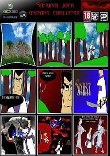
To continue with the storyboard I was given a basic storyboard with enough frames to start. Physically I drew the frames in total I did bout nine frames. After I hand drawn the storyboard I scanned them into photoshop when the appropiate layout was formed.
On the other hand I was getting the storyboard layout ready on Photoshop. For the frames I used two layers I made one small with a black background and behind I made another layer but I made it big enough that it gives a simple white outline with this I copied and pasted it eight times to create the amount of frames needed.
On the title section I used the font abbadon for the title and for the speech in the comic, also in the top left corner there is a small spot of white for that effect I used the gradient tool I used this multiple times in my storyboard as this can help create a dramatic effect or help add tension. I also added Jpeg images as this can also help create a visual satisfaction and help form or mold a theme.
My favourite frame would have to be frame eight as this shows the enemy samurai dead and shows plenty of blood, to express this I used multiple brushes to create this effect. There were much choice for this but I used a selected few. Also in the same frame I added an image of the Pokemon Haunter this image helps add darkness to the concept of death as his demeanor, the idea looks sinister and that was the idea I was going for.
Visually the first frame is in 3D but I added a transform tool to add a visual effect which in my honest opinion doesn't work as it is compacted and looks like it is imploding. Anyway the effect of 3D was based on the founding idea of the story in the forest it works as I used 3D Studio Max to create a scene and in that program there was pre-set foliage feature which hap a multiple selection of trees, to help keep the storyboard faithful to the source I added in Japanese Ceerry Blossoms and I also added Willows to help vary it. Also for the background for the top three frames I added a sky image to help it make it look more realistic.
Thursday, 10 June 2010
Evaluation for Unit 64, 65 Comparison
Example: Normandy 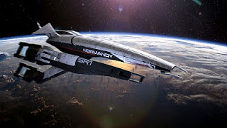
I am going to compare how my ship compares to a professional example.
I have chosen the ship
To look at a ship such as the

Just above is the ship that has been created by a team of professionals. The appearance looks realistic the texturing looks perfect as the metal texture looks real. The physical model has indents into the sides of the ship which show the wings joints. Also the scale of the ship is huge it has been crafted with delicate attention and sensitive eyes. It took them about two to three months to get this complete and the end result was worth it. The size of it looks standard and everything looks symmetrical and balanced.
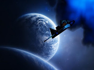
My new ship took about two weeks to make then again this is my first official project so quality is not as good as the

Evaluation for Unit 64, 65
What you enjoyed?
I enjoyed the creative process of this project, I was able to make different designs for a ship as the choice was a ship or a car and thinking about a car it is restricted to one design but a space ship can be different physically. I had hundreds of ideas for a ship such as it s shape its size and features such as weapons and armour. I created a mood board with different influences the general picture was a ship with offensive capabilities. I created my first ship and I realised there were many design flaws so I changed many because I realised that making such features will take up much attention and detail. I made a decision to make a new ship. Since I had such limited duration of time to do so I rushed it a bit and physically the ship was no better than my first one but the main physical flaw was removed my ship didn’t look like a basic box. Another thing I enjoyed doing was making a planet for my ship to orbit around I got a basic primitive sphere and I applied an ash texture to it and with some use of projecting lights I made the planet look like it was on fire. Also I found some pre-set foliage options which I used it made the planet more vibrant than it should be.
In general I enjoyed the whole experience but the thing I would like to most is to work with in depth particle effects and I know there are some as I have explored and used some such as in the new ships video its been chased by fire. I would like to create an explosion or work with the physics to work with planets gravity.
Also exploring further features I was able to learn about basic particle effect such as fire and weather conditions such as hail and rain. I have learnt how to unwrap objects to use as a map for a ships physical appearance. The process known as UVW Unwrapping was difficult at first but listening to the tutor he explained like it’s a giant jigsaw that you have assemble piece by piece. This translated into finding the pieces working with them and then putting it back together. His advice aided greatly as the textures I did were perfect even though the physical quality of my ships aren’t the best. I have learned that to start again is to have a clean page which can be used for new ideas. Know this creating a ship might be difficult but patience can result in detail and progression. If I could start again I would make a ship more bigger rather than a fighter plane I would make a ship identical to ones I see in games such as the
Tools used:
Basic primitives
Lights
Camera
Auto Key
Timeline
UVW Unwrap
Editable Mesh
Material Editor
Photoshop (for the textures)
Evaluation for Unit 64,65 basic outline
For my Unit 64, 65 work I had to develop an object I had the decision of a car or a spaceship, I decided to go with a spaceship as with this I am able to explore my imagination for different styles of ships. When I started I created a mood board to help with the design I looked at multiple examples of well known ships in the sci-fi genre and also alien vehicles.
After a bit of research I drew up some designs for my ship originally it was to have a crystal on the back to be its fuel source but I thought about that and it would be hard to model and the texture would be a bit hard to do so I got rid of that the main structure was just a box with wings and the front of the ship was slanted down to make way for a cockpit. I did some concept art at different angles such as top, left and front and side. I looked at the design again and made some more changes such as the appendages I originally designed.
Now I started to work on the 3D model itself it took about three weeks to make but it was similar to the original design. After that I started to work with texturing. I changed the model to an editable mesh and this helped me in the construction stages. I used the UVW Unwrap modifier which helped me make a blue print of the ship. Given that it was simple once explained so I unwrapped it and made a suitable outline for what the ship could look like I placed the blueprint into Photoshop and after some image manipulation I created a metal texture with a hint of beige I think.
Also as part of the texturing I have placed some popular images on my ship on the side I placed the Ghostbusters logo and at the bottom of the ship I placed Han Solo frozen in carbonite. After texturing I managed to create an animation which had the ship following a line that circles around a planet I made. It was basic really.
I grew tired of my old ship so I created a new one. This new ship would be better. Since I started again it took me a week to make it because of this time lapse it is of a really basic design. This was a good thing as I could do new textures for the body I used a recycled crystal texture that I made. Also unwrapping the new ship was easy because I had some experience with texturing I manipulated the new ship and placed some unusual pictures on it. I used a brush on Photoshop in the shape of a symbol and I placed on the front I also found an image of a phoenix which I used.
For the animation of the new shop I practiced using some particle systems such as fire and glowing lights with some practice I managed to make the ship been chased by fire. I would use a camera for the animation but I am not really experienced in that area.
Brand New Ship

I grew bored with the last ship I had so I decided to make something new.
This new ship is much better than the old one as I was able to make new textures and some new animations.
Subscribe to:
Comments (Atom)
